Subscribe to get the latest news and updates.


Zydus group is headquartered in Ahmedabad, India, and ranks 4th in the Indian pharmaceutical industry. The group has manufacturing sites and research facilities spread across five states of Gujarat, Maharashtra, Goa, Himachal Pradesh and Sikkim in India and in the US and Brazil.
Zydus’ global business has a strong presence in the regulated markets of the US, Europe (France and Spain) and in the high profile markets of Latin America and South Africa. It is also present in a big way in 25 other emerging markets worldwide.
Zydus’ Innovation programme is spearheaded by 1500 researchers across 19 sites, working on differentiated medicines for the future.
From NCEs to vaccines, biosimilars and niche technologies, the group is exploring
different ideas and concepts, innovating constantly.
The first NCE from an Indian research pipeline to move from the lab to the market.
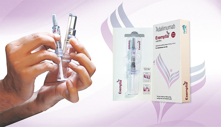
Provides a new lease of life to Indian patients of inflammatory arthritis, who did not have access to this revolutionary therapy, so far.
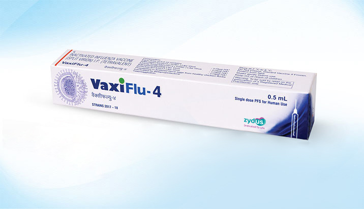
The vaccine provides protection from the four influenza viruses- H1N1, H3N2, Type B (Brisbane) and Type B (Phuket).
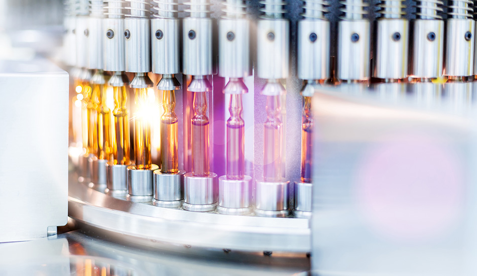
As one of the key players amongst the pharmaceutical manufacturing companies, the group has manufacturing capabilities across the entire pharmaceutical value chain: including formulations, APIs, vaccines, biosimilars, complex products (transdermals, topical etc.), animal health products and wellness products. It has more than 30 manufacturing plants worldwide including India, Brazil and USA.
Mr. Pankaj R. Patel, Chairman, Zydus Lifesciences Limited conferred with Padma Bhushan
Posted on: 26 Jan 2025